
This page is a worked example (a leaf). The canonical for how we audit is How we audit.
The scoring machine that graded 38,518 HVAC companies now grades plumbers in 26 metros. Nothing about the machine changed. One configuration file did, and the second industry went from empty database to 4,439 scored companies in two working sessions.
That’s the claim, and the rest of this article is the evidence: what the rollout actually produced, the architecture that made a second industry nearly free, the five bugs it surfaced, and the limitation we found in our own data source. If you are building something similar, the useful part is not the result. It’s the shape of the process that caught the mistakes.
Compare the Two Rollouts
The scorecard grades local service companies 0 to 100 across four categories, Maps Visibility, Website Quality, SEO Authority, and Social & Content, using public data from Google Maps via DataForSEO, Google PageSpeed Insights, and the open web. Grades use a national percentile curve within each industry, so a plumber is only ever compared with plumbers.
| Run | Metros | Harvested | Scored | Filtered Out | Elapsed |
|---|---|---|---|---|---|
| HVAC (original national build) | 217 | 38,518 | ~26,100 | ~33% | ~1 month |
| Plumbing wave 0 (Phoenix test) | 1 | 231 | 140 | 39% | 25 minutes |
| Plumbing wave 1 (top 25 metros) | 25 | 6,334 total | 4,439 | 30% | 1 working session |
Two things in that table matter more than the speed. First, the exclusion rates hold across industries: roughly a third of what Google Maps returns for service keywords is not a service contractor. It’s supply houses, auto shops carrying “air conditioning repair” as a category, big-box service desks, and in 71 cases, Canadian and Mexican businesses leaking across the border from Buffalo, Detroit, and El Paso searches. A scorecard is only as credible as its filter, and the filter absorbed most of the engineering time on both industries.
Second, the API cost of the plumbing rollout was under fifty dollars at the time of writing. That number is only interesting because of what it implies about the next industry, and the one after that. It did not hold. See the update at the end of this article.
Trace What a Config File Actually Controls
The system is five layers, and a new industry touches four points across them, all four set in one file:
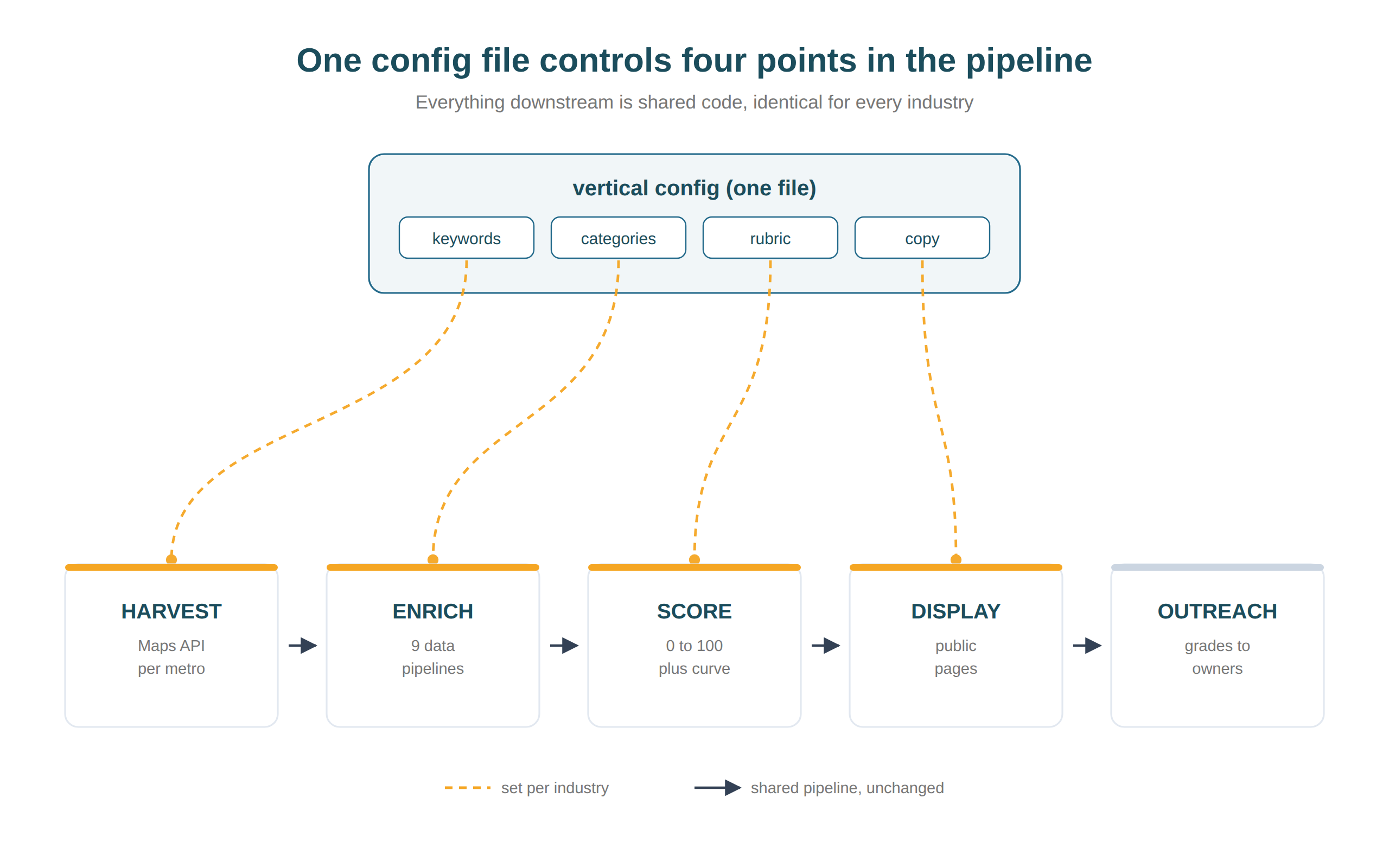
The plumbing file holds seven harvest keywords (“plumber,” “drain cleaning,” “water heater repair,” and four more), the Google Business Profile categories that count as a real plumbing contractor, the disqualifiers that don’t, dedup noise words, and the page copy. Everything downstream reads that file: deduplication, enrichment, percentile grading, page generation.
The previous approach, documented in our own earlier playbook, was to fork the codebase and stand up a separate database per industry, estimated at two to three weeks each. Per company, what the machine does is the automated version of the manual Quick Audit process we used to run one business at a time, which is exactly why it was worth automating and exactly why the filter matters so much.
Learn From What Broke on Launch Day
The second industry was the first real test of the multi-industry design, and it found what tests are supposed to find. Every one of these was caught at a human checkpoint, a config review, a dry run, or a fifteen-company spot-check against live Google Maps, before it reached a public page:
| Bug | Symptom | Root Cause | Fix |
|---|---|---|---|
| Enrichment rows mislabeled | 231 plumbing rows tagged as HVAC | Insert relied on a column default | Stamp the industry explicitly on every write |
| URL slugs never generated | 0 of 6,334 companies had page URLs | Hook keyed on IDs the database creates after insert | Select by industry instead |
| Rows silently skipped | 22 companies missed by a backfill | Paginated queries sorted on a non-unique column | Unique sort keys on every paginated query |
| Real contractors excluded | “GEW Mechanical” filtered out | “mechanic” matched inside “Mechanical” | Word-boundary matching |
| Imposters included | Home Depot service desks scored as contractors | Their Google category is literally “HVAC contractor” | Brand denylist plus automotive-category rules |
The pattern across all five: every failure was invisible in aggregate statistics and obvious the moment a person read actual rows. Counts looked healthy while a third of the data was mislabeled. The spot-check, fifteen random companies checked by hand against a live Maps search, is the cheapest quality gate in the system and the only one that caught the last two.
The other pattern worth stealing: the single-metro test wave. Phoenix cost about fifteen dollars and surfaced three of the five bugs. Finding them in the twenty-fifth metro instead of the first would have meant re-running everything.
Compare Our Snapshot With Live Google Maps
The spot-check also surfaced a limitation worth stating plainly. Three highly rated Phoenix plumbers that appear in a live, personalized Google Maps search were absent from the top 100 results the Maps API returns for the same keyword. We verified this against the raw API response. They were never delivered to us, not dropped by us.
Google serves different results to different surfaces. The live map pack is heavily proximity- and personalization-weighted, while the API returns a flatter relevance snapshot. So the scorecard measures a consistent, unpersonalized view of each market, which is what you want for fair cross-market comparison, and it is not identical to what any individual sees on their phone. That distinction matters for anyone working on Maps ranking for a local service business, where your own phone is the least reliable measuring instrument you own.
A fourth company sat at position 98 of our 100-result harvest depth, which told us the depth setting matters more than we assumed. Doubling it roughly doubles harvest cost and is the cheapest coverage upgrade available to us. That trade-off is now a documented setting rather than an accident.
Apply the Pattern
Grades stay dark until a market is deliberately published, and no industry gets a percentile curve until its pool crosses 1,000 scored companies, because small pools make percentiles meaningless. Plumbing cleared that threshold in wave 1. The publish switch is a decision, not an automation.
Pick one.
- If you are building a multi-tenant data product, the transferable pattern is three rules: one config file per tenant with zero tenant-specific literals in the pipeline, a dry run that must show real planned work before any spend, and a named human reading actual rows at every gate. The dry run and the spot-check caught what the test suite could not.
- If you are running the next industry on this system, start with one metro, spot-check fifteen companies by hand against live Maps results, and only then scale. Fixing a keyword list after one metro costs cents. After 200 metros it costs a re-harvest.
- If you run a local service business, the HVAC Marketing Scorecard is live now and plumbing follows when the markets publish.
Drafted with an agent from the August 17–18 plumbing rollout session logs. Facts verified and published by Daniel Goodrich, August 20, 2026.
Update, September 2026
Two numbers in this article have moved since it was published, and one of them moved enough to be worth correcting rather than quietly editing.
The cost claim was too low. Under fifty dollars was true for the metros scored by August 20, because harvesting is genuinely cheap and most of the plumbing database had not been enriched yet. Enrichment is where the money goes, and enrichment is what turns a harvested company into a graded one. Verified lifetime API spend across HVAC and plumbing is now $701.04. The lesson survives, but the number does not: a second industry is nearly free to harvest and is not free to grade.
The scale moved. Plumbing went from 26 metros and 4,439 scored companies to 126 metros planned, 112 scored, and 14,903 scored companies. None of that required touching the pipeline. The config-file claim held up under roughly five times the load.
What we got wrong about cost. Our data provider charges per request plus a small amount per row, and allows up to a thousand rows per request. Almost all of the cost sits in the request, not the data. Our backlink enrichment calls the API once per contractor, which is the most expensive way to ask the same question. Our traffic estimation already used the bulk endpoint: 20 requests, $1.24 total. The bulk pattern was sitting in our own codebase, working, on a different field. Migrating the rest of enrichment to it is now the top priority.
Read the pricing page as carefully as the API docs. A per-request fee turns a loop into a bill.
Originally published .